Color impacts us every single day, whether we’re conscious of it or not. As a painter, I’m guided more by color than by shape or line. A sweep of coral in a foggy sunrise, the cast of milky blue in distant mountains, vineyard rows filled with mustard-yellow blooms; color holds emotion, movement, and memory. So, it’s no surprise that it would also play a powerful role in visual platforms like Pinterest.
What may be surprising, though, is that color is part of Pinterest SEO.
Yep! Pinterest takes the dominant color into account when ranking Pins in search results.
I don’t see this fact widely discussed, but it holds real power for artists, designers, and anyone using Pinterest to share their work. And after a few months of experimentation, I saw that using dominant color as a tool in my Pin designs helped move the needle on some of the most stagnant Pins.
When Brand Colors Aren’t Enough
We often design Pins using our brand colors, which makes sense. We want consistency, recognition, and cohesion. However, when it comes to discoverability on Pinterest, brand color alone might not be what gets your pin seen.
In fact, a study from Tailwind found that only 4% of the most viral Pins used the brand’s color palette as the main design element. The rest leaned into color strategies that aligned with Pinterest’s algorithm, and yep, dominant color was one of those key strategies.
Pinterest’s visual search engine favors images that align with high-performing content in a given niche, which includes color.
This means that if the top-performing Pins for a keyword are using pale greens, dusty pinks, or moody blues, your Pin, dressed in bold reds or earthy ochres, might not rise to meet them.
My Experiment with Dominant Color
Earlier this year, I began experimenting. I’d left my Pinterest business account dormant for nearly a year (arg!) with only sporadic Pinning in early 2025. It’s no surprise that impressions and engagement had dipped. But in March, I began researching the dominant colors that appeared in search results for my targeted keywords.
Then, I designed my Pins using those top 4–5 colors, not my brand colors, but the ones Pinterest itself seemed to be favoring.
The shift was immediate.
Even after just one month, the new Pins created using the dominant color strategy had more impressions than the older Pins that had been circulating for much longer.
Of course, regular Pinning likely helped too, but the difference in performance between the Pins was too stark to ignore. My brand-color Pins had been around for months, with lukewarm engagement. See them below:
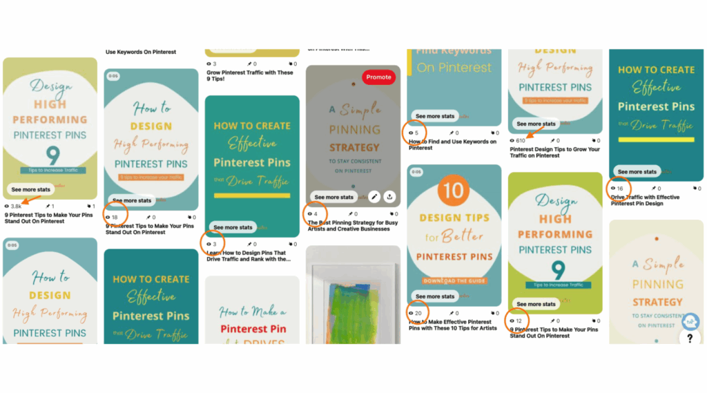
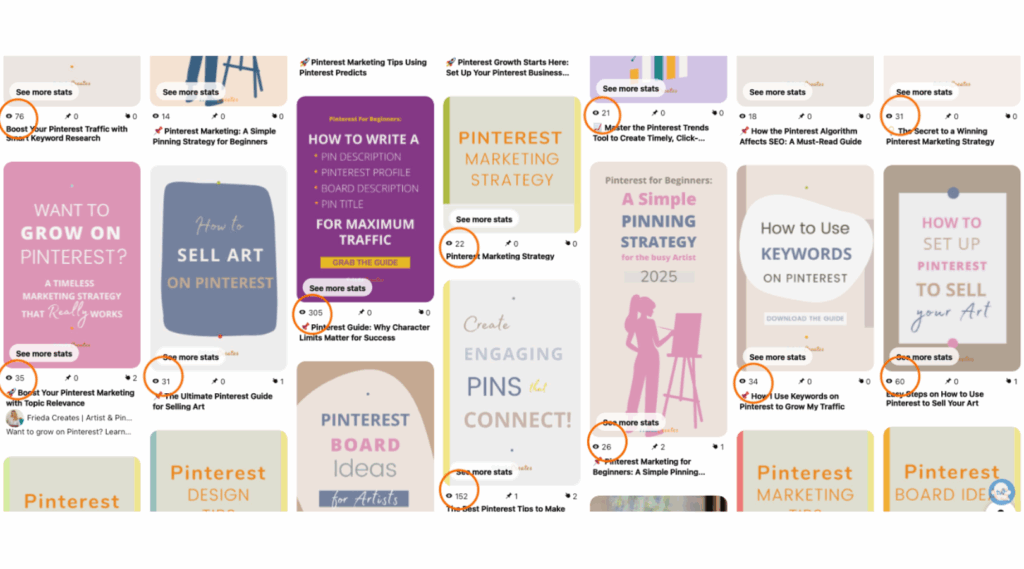
The new ones? Visibly outperforming after just weeks.
If you’re interested in diving deeper into what Pinterest looks for in high-quality Pins, I explore more of those visual cues and ranking factors in this blog post on Pin Quality.
So! What Is a Dominant Color?
On Pinterest, the dominant color is simply the most visible or prominent color in an image. Pinterest’s algorithm uses this visual cue, among many others, to decide where and how to surface Pins in search.
If your Pin’s dominant color is similar to the colors used in high-performing Pins for a given keyword, your Pin is more likely to be ranked favorably and seen by more people.
It’s subtle. It’s nuanced. And it’s something few Pinterest guides talk about.
Why This Matters, Especially for Artists
As artists and creatives, we feel color before we name it. Color shows up in how we dress, how we decorate our homes, how we move through the world. Color holds vibration and energy. Some say it even heals.
So it makes intuitive sense that a visual platform like Pinterest would respond to color too, not just emotionally, but algorithmically.
And yet, this concept, that color affects SEO, is still a bit of a secret.
You’ll find plenty written about color psychology in branding. You’ll find marketing trends that favor warm tones or neutrals. But how to use dominant color as a keyword-aligned strategy for Pinterest SEO? That’s still a quiet corner of the internet.
For those of us who live by color, that corner feels familiar, like home.
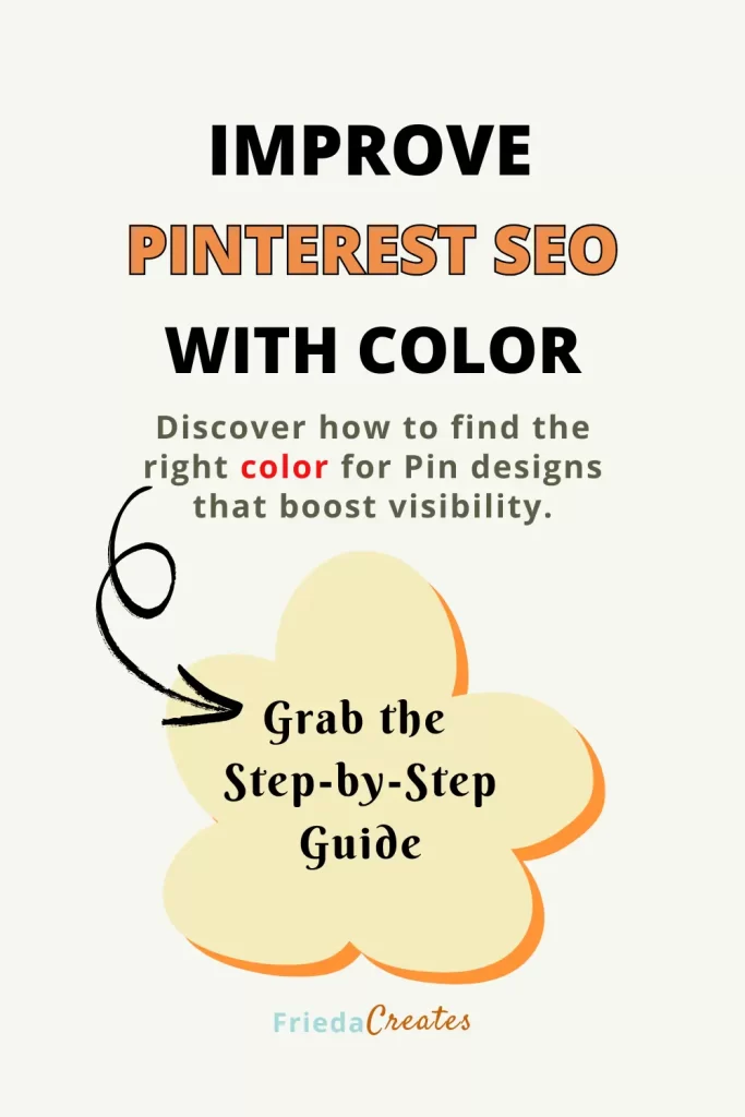
Want to Try This Yourself?
If this idea intrigues you, if you want to explore Pinterest growth by applying color strategies that are backed by both algorithm and artistry, I’d love to show you how I do it.
When you sign up today, I’ll send you a free mini-guide that walks you through the exact steps I use to find dominant colors and how I incorporate them into my Pin designs. ⤵️
Your Pins deserve to be seen, and
Color might just be the key!
Share the Love!
Save one of these Pins to the most relevant board so you have it for later. This is also a great way to build Domain Quality, you can learn more about that here. 📌